Saturday, November 16, 2013

New High Market Tour Update

The S&P 500 hit a new high this week, gaining 1.6%.  Reviewing the Baseline Analytics Trend and Sentiment chart published in our public charts on Stockcharts.com, most technical indicators for this major index (and the market in general) are lined up to support the uptrend.
 
Note that in the chart below, the S& P 500 broke above an upper channel trendline in October (green arrow) and appears to have set the 1750 level as intermediate-term support.  The ascent since mid-November was accompanied by improving RSI (which does not yet appear overbought), even though the chart pattern looks tired and nimble at its new high (a 1% decline in the S&P 500 would be welcome at this juncture)!
 
b2ap3_thumbnail_BLABlogA11162013.png

KST (Martin Pring’s “Known Sure Thing” remains bullish, however a little momentum shift is seen  with the blue line cross below the red line.  A more material concern for bulls is the shift toward complacency with VIX and the Put/Call ratio (seen at the bottom of the chart).  You will note the red and green horizontal lines on the Put/Call chart, denoting extreme readings where short-term trend changes have historically occurred.
 
When markets move to new highs, it behooves us to extend the timeframe in technical analysis, and the chart below shows the S&P 500 on a monthly basis.  The monthly chart of the S&P 500 expresses the bullish secular (long-term) trend that has transpired since the bottom in 2009, with volume activity lagging the strength of the price uptrend.
 
b2ap3_thumbnail_BLABlogB11162013.png

The final chart below is a depiction of market breadth and internal strength.  After a bout of weakness in October and early November, Advances vs. Declines and New Highs vs. New Lows have once again moved toward new highs.   The one concerning development expressed in this chart is the behavior of the Summation Index (NYSI).  As noted in past blogs, the Summation Index is a useful momentum tool that tends to define the “400” level as the Bull vs. Bear dividing line.  Although the index closed at 393 on Friday, it appears to want to resume its uptrend and may simply be working out the remnants of the weak momentum experienced in the late October-early November market.
 
b2ap3_thumbnail_BLABLogC11162013.png

So what does this all mean?  Although the trend remains supportive of long positions, selective longs (i.e. value and dividend plays) and cost-averaging into equity mutual funds (partial positions rather than all-out bullish bets) feels like a prudent strategy at this juncture.

Learn more about Baseline Analytics TrendFlex and our TrendFlex signals.

Friday, September 20, 2013

Revisiting Growth vs. Value: A Bullish Omen

An indicator supporting the bullish case in the ratio of growth stocks vs. value stocks.  We measure this ratio by using the Russell 2000 Growth Index (RUO) divided by the Russell 2000 Value index (RUJ).   In the chart below, we show the ratio with its 50-day moving average to capture the overall trend (blue line).
 
b2ap3_thumbnail_GrowthValue09613.png
 
Note that in recent setbacks in the S&P 500 (bottom of chart); value would tend to outperform growth in a bid for defensiveness.  As you can see with the recent market consolidation, however, growth continues to outperform value.  Perhaps we see a “brave new world” emerging in this relationship.
 
Our suspicion for this rather unique behavior is based on the sector make-up of the Growth vs. Value indices.  The Russell 2000 Value Index is more heavily-weighted to interest-sensitive stocks such as utilities and financial services as compared to the Russell 2000 Growth Index.
 
As long as Growth outperforms Value, we believe that there is underlying strength in the equity markets.  We also believe strongly that rising interest rates can be bullish for equities as they suggest underlying strength in the economy.  Managed rate increases with a tempered inflationary outlook can continue to support equities as the asset class of choice, as valuations remain reasonable and occasional political and macro-economic fears introduce the potential for a buying opportunity.

Click here to subscribe to Baseline Analytics TrendFlex market trend signals as well as StockStash and ETF Zone selections.

- Baseline Analytics

Sunday, June 30, 2013

Revisiting a Reliable Trend indicator

A market breadth indicator that has proven reliable to assess the market trend is the New York Stock Exchange Summation Index.  Developed by Sherman and Marian McClellan, the McClellan Summation Index is a breadth indicator derived from the McClellan Oscillator, which is a breadth indicator based on Net Advances (advancing issues less declining issues).

(Click here to enlarge)
b2ap3_thumbnail_NYSI062813.png

Baseline Analytics has used the "400" level on the NYSI to delineate between bullish and bearish trends.  As can be seen in the chart below, that level has marked trend changes rather reliably.  To enhance the value of the NYSI indicator, we have applied a 20-day simple moving average.  An early trend-change signal is flashed when the NYSI crosses this moving average.  The summation index is typically used for medium-term and long-term timing (whereas the McClellan Oscillator is effective for more of a short-term horizon).  This is because the slower cumulative nature of the Summation Index requires more data points to support the current trend.  This indicator is not perfect, but represents another tool in the technical analysis toolkit worth tracking.

What is the NYSI telling us today?  the NYSI effectively flagged the market setback in June. At its most recent reading of -134, it is not yet at an extreme reading that would suggest a trend change. We will look out for the early signal moving average cross to consider a potential market trend shift to an uptrend.

- Baseline Analytics

Sunday, June 16, 2013

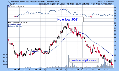
Is JO (Coffee ETN) Going to Zero?

As a market technician, I cannot help but marvel at how some price patterns exhibit parabolic euphoria or parabolic gloom. Looking at the iPath-Dow Jones IBS Coffee ETN (JO), I can't help but speculate how low this price will go. I'm still drinking my 4 cups per day and I haven't seen any coffee shops close lately.


Weather is clearly the factor for the weak prices, as favorable conditions in Brazil, Vietnam, Columbia all transpire to yield a bumper crop.

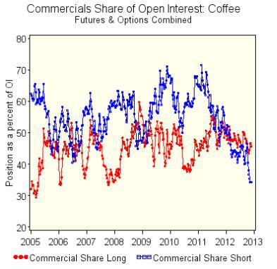
What is interesting is the Commitment of Traders report from this Friday. The Commercials (the smart money we will call them) have continued to reduce their short exposure. As seen in the chart below, the ratio of short to total open interest for coffee futures and options is at its lowest point since 2006 (the blue dotted line).


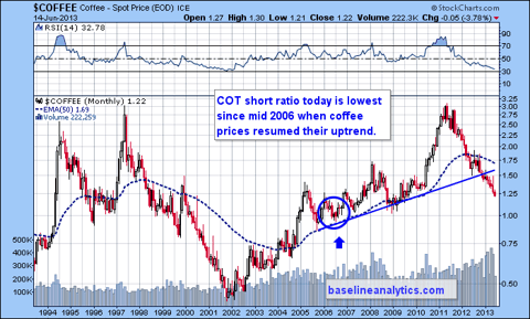
Note the coffee weekly chart below. When the COT ratio was at its mid-2006 low, coffee prices began to recover and resume their uptrend.


Based on the COT report and the slaughter that JO has been through since its peak in the Spring of 2011, it may be worth speculating on a price recovery of this commodity.

Visit Baseline Analytics for insightful investment opportunities.

Wednesday, June 5, 2013

S&P 500 At Important Technical Juncture

Today's 1.38% decline in the S&P 500 has left the index sitting atop its 50-day exponential moving average support. In addition, the RSI (Relative Strength Index) of the S&P 500 has fallen to levels that, during this uptrend, have contained corrections. See the chart below:


What does this mean? Should equities see a bid and a potential bounce at this juncture, a follow-through and potential continuation of the uptrend may ensue. If, on the other hand, the S&P 500 closes below 1600 and RSI dips further below the 40 level, a more pronounced correction may ensue. That correction may resemble the setback experienced in November 2012.

So watch the balance of the week's action. We will be watching carefully at Baseline Analytics. Should the market begin to firm, we will be looking to add to long positions. For the time being, we will remain cautious with protective stops and step aside until the market figures out what it wants to do.

- Baseline Analytics

Thursday, May 23, 2013

Stock Market Trend Indicators Remain Firmly Positive

As the equity markets reach for new highs, support for the uptrend is reinforced by a series of market indicators that remain firmly bullish. Baseline Analytics categorizes these indicators into three broad components:
1. Trend and Sentiment
2. Breadth and Internal Strength
3. Economic Indicators

Here is a visual display of how these indicators are performing today.
Trend and Sentiment. The steep uptrend in the S&P500 is steeper for my liking and would suggest a pause at some point relatively soon. Based on the strength of the uptrend, however, a pause is more likely to be seen as a trading range market or consolidation of recent gains, rather than an outright correction. Sharp trendlines like that shown on the S&P500 ultimately get broken. As for sentiment indicators, we look for extremes in VIX (such as a reading of 12 or below) and the Put/Call Ratio (such as a reading of 0.60 and below) to suggest a possible trend shift to the downside for equities. We do not see that in today’s indicators, as both remain neutral.

b2ap3_thumbnail_blog1_20130522-032451_1.png

Breadth and Internal Strength. Indicators such as the NYSE Advance/Decline Ratio, New Highs vs. New Lows and the NYSE Summation Index all point solidly in the bullish direction with no divergences from equity market performance. The Summation Index is a breadth indicator based on Net Advances (advancing issues less declining issues). We look for the 400-level to mark the dividing line between an uptrend and a downtrend (the reading closed on Tuesday at 1218, nearly a new high).

b2ap3_thumbnail_Blog2.png

Finally, Baseline Analytics reviews a series of economic and industry sector indicators. LQD vs. IEF is a ratio of corporate vs. US Government bonds. As the ratio climbs, the equity markets tend to move to the upside. Copper vs. US Bonds prices, as well as the S&P500 relative to bonds, reflect economic strength and risk appetite, as rising trends tend to coincide with higher equity prices. Copper has struggled for a while; despite the pickup in housing starts, mediocre GDP growth as well as a slowdown in China GDP and manufacturing growth rates may be factors weighing on this indicator. This represents a negative divergence from the equity markets. Other indicators of economic strength and reinforcement of the “risk on” trade include the relative outperformance of Small Caps vs. Large Caps (see our recent Blog on the topic), as well as outperformance of discretionary stocks vs. staples and defensive equities.

b2ap3_thumbnail_Blog3.png

The strength of these market and economic indicators lend support to the bullish case. As most of these indicators push to new highs, caution is warranted, and a pause in the uptrend would be viewed as a welcome respite and an opportunity to join in on the rally and a favorable entry point.

- Baseline Analytics

Saturday, May 11, 2013

Time For Growth To Outperform Value?

One of the indicators favored by Baseline Analytics is the Growth vs. Value Ratio. This is measured by taking the Russell 2000 Growth Index (RUO) divided by the Russell 2000 Value Index (RUJ). To measure trend, we plot this ratio against its 50-day exponential moving average. See the chart below:


As you will note, the Growth/Value Ratio, denoted by the solid blue line, tends to outperform during uptrends in the S&P500. Conversely, the Growth/Value Ratio underperforms during S&P500 downtrends, as value tends to be favored. Growth stocks tend to outperform during bullish enthusiasm, presiding during the "risk-on" trade.

In April, you can see that the ratio edged above its moving average (very slightly) and appears to be forming a respectable basing pattern. A climbing ratio will be supportive of a continued advance in the market indices. Keep a watch on this activity.

- Baseline Analytics