Friday, November 23, 2012

Using VIX and Put/Call to Identify Trend Change

Market sentiment can be measured in many ways.  These include Investor's Intelligence surveys, the Daily Sentiment Index (DSI), as well as readily-available VIX and Put/Call ratio indicators.

Baseline Analytics TrendFlex uses VIX and Put/Call ratios as an indicator to assess the risk of the current trend changing.

For example, see the chart below.  The S&P500 is plotted on the main chart with VIX (pink line) behind it, and the Put/Call ratio below.  Each indicator is compared to its 34-day exponential moving average.
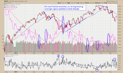


You will note the ovals drawn at various points on the VIX chart as well as circles drawn on the Put/Call ratio chart.  These indicate extreme points vs. the indicator's 34-day exponential moving average.  VIX and Put/Call indicators and their "gap" from the moving average are treated as contrary indicators.  In calculating part of its TrendFlex Score, Baseline Analytics treats an extreme high in VIX or Put/Call, considered "extreme fear," as a contrary indicator.  This signals a potential bullish trend change.  Note the extreme points marked at the start of June 2012.  That point effectively signaled a shift in the S&P500 from a downtrend to an uptrend.

Although this signal is not 100% effective on its own, traders and investors are encouraged to use this tool alongside other technical indicators to assess the risk of change in the current trend. Click here to learn more about Baseline Analytics TrendFlex indicators and our TrendFlex Score designed to measure the risk of a trend change.

Saturday, November 3, 2012

Market Breadth Reinforces Uptrend


As the S&P500 settles down from its recent highs, it is reassuring (for Bulls) to note that market breadth remains healthy.

The chart below has been a regular feature of the Baseline Analytics blog.  It depicts the following market breadth indicators:

  1. Advance/Decline ratio of the New York Stock Exchange (NYSE).
  2. NYSE Up Volume vs. Down Volume
  3. Stocks reaching New Highs vs. New Lows
  4. Ratio of New Highs vs. New Lows.

As can be seen by the behavior of these indicators, market breadth has been positive and remains in an uptrend. Baseline Analytics TrendFlex weights these indicators to develop a market breadth score.  On a scale of 1-3, 1 being Bullish and 3 being Bearish, this week's Market Breadth score is at 1.75.  This is better than Neutral (2.0) but not an overly-bullish 1.0 reading.

The S&P500 is depicted on the top chart as the orange/brown line.  Note how SPX diverged from the A/D line in mid-October as the index corrected almost 4% from its peak.  The firmness of market breadth indicators, however, suggest internal strength. 

There is no doubt that, from a weekly perspective, the S&P500 remains in an uptrend. Its recent consolidation as seen on the daily charts is just that; nothing more than a corrective move amidst the larger uptrend.

We would turn negative on the S&P500 should market breadth start to roll over.  That would manifest itself in a downtrend in the A/D line and/or negative readings in Up vs. Down volume activity (following recent highs in the index, it will take a lot of effort to push the New Highs vs. New Lows figure into negative territory).

Market breadth indicators should be a part of an investor's toolkit in assessing the strength of the stock market trend.  Click here to learn more about Baseline Analytics TrendFlex and our market indicators.