Is this current setback in the equities a normal consolidation in an uptrend, or does it foreshadow more serious weakness ahead? In addition, are there indications that might suggest the start of a topping process in stocks?
On a weekly basis, we review 23 charts depicting various trend-following and sentiment indicators. Here are some noteworthy observations that suggest a neutral (if not modestly bullish) stance on equities.
Stocks comprising the S&P500 trading over their 50-day moving averages (known as “bullish percentage”), a proxy for a healthy uptrend, have declined from a peak of 95% in October 2010 to 67% today. Based on our historic back testing of the bullish percentage indicator, a level of 55% or higher has sustained a bullish trend. But the waning participation of many equities (commodities, materials, energy and financials are most to blame) raises caution. Volume has been lackluster, both on up-days and down-days, a neutral indicator.
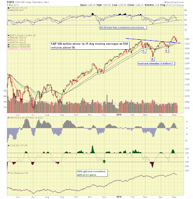
Similarly to waning bullish percentage, a measure of price momentum has diverged from the uptrend in the indices since peaking in October. The Relative Strength Index (RSI) of the S&P500 reached overbought peaking levels in Q4 2010 as the S&P500 gained. But as the S&P500 reached a higher high in late April, RSI sat a a lower level than when the S&P500 hit its earlier peak in February, a classic sign of "divergence" and a warning to bulls. The Nasdaq exhibits a similar weak showing.
Chart of the S&P500 noting weakening RSI
We have had four of these stock market pullbacks since November 2010. During the pullback in March, when the S&P500 swooned about 7%, bullish percentage fell to 42%, and one of our closely-followed indicators, the New York Stock Exchange Summation Index (measuring cumulative advances vs. declines) poked briefly into bearish territory. The question is whether other indicators that held strong during the previous setbacks in March and November are now turning negative. Let's take a tour and see what (if anything) is different this time.
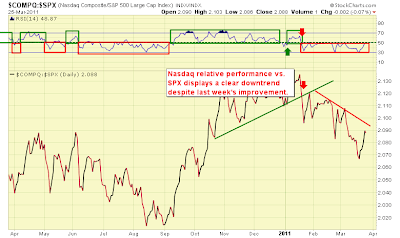
Starting with the positives, the Nasdaq has begun to outperform the S&P500. Historically, such outperformance has been a leading indicator of strength for equities. We saw the Nasdaq underperform since January 2011 through the March correction, only to outperform since mid-March. See below:
Nasdaq vs. the S&P500 shows outperformance
On the flip side, strength in financial stocks has also been an important support for the broader indices. It is hard to argue that financial companies are not an important driver to sustain and expand growth in the economy. Financials have underperformed vs. the S&P500 since peaking in April 2010, and they continue to underperform now as they did in March, hitting new lows in relative strength. Despite this underperformance, however, our relative strength indicator (RSI) is diverging positively and showing some signs of strength. When RSI diverges (heads in a different direction) than price, we pay attention as this may suggest a change in trend. See the chart below:
XLF (Financials) vs. the S&P500 shows positive divergence
There are several market indicators we follow as proxies for global economic conditions and sentiment toward global growth. One of those indicators is a ratio of copper prices to the 30-year Treasury bond. In the best of growth worlds, this ratio would climb as copper prices rise and bond prices decline (while interest rates rise), a bullish economic scenario. This indicator peaked in February and is now sitting at support marked by peaks in April and November 2010. We measure RSI with this index too, and it tells a slightly positive story as RSI failed to reach a lower low (it diverged) as the index fell to a lower low.
Copper vs. Bonds: growth story still intact, but softer
Alongside weakness in copper prices and commodities, perhaps also suggesting a softening in economic growth expectations, we have seen a pickup in Treasury bond prices. Long-term Treasuries have gained about 6% since the beginning of April and just briefly surpassed their peak hit during the March correction. RSI has been positively diverging as price established a double-bottom and held long-term support. Rates, inversely, have been falling. See the chart below:
Treasuries gain as risk-aversion increases and economic growth softens
Another indicator is the ratio of Corporate Bond prices to the medium-term Treasury bond (represented by the Exchange-Traded Funds, or ETF's, "LQD" and "IEF"). Corporate bond relative strength tends to correlate positively with the S&P500. We look for turns in the relative strength ratio of LQD/IEF to provide warning signs of turns in the S&P500. When corporate bonds decline vs. Treasuries, that tends to indicate a rise in interest rate spreads in risky vs. "risk-free" debt and tends to be a negative leading indicator for equities. Currently this indicator barely favors bonds over stocks (let's call it neutral), but it has been erratic lately and is not displaying as weak a reading as it did in March. See below:
Corporate bonds vs. Treasuries indicator is neutral
The "risk-on" trade which favors equities also is captured by the relative strength of small caps versus large caps, and the relative strength of growth vs. value stocks. Both of these indicators remain bullish, although small caps have begun to challenge their uptrend line drawn from the March 2009 lows:
Small Caps relative strength rests precariously on their uptrend line
To wrap up, our indicators generally suggest that this correction is a normal pullback in an uptrend. At the Annual Symposium of the Market Technican's Association, held in New York earlier this month, the market forecast panel largely remained bullish (with a 17,000 Dow target a few years out being cited). The short term seems to be plagued perhaps in part due to the "sell in May and go away" warning, and/or early fears of the end of QE2. Also, several events have come to the surface and are likely causing some retreat in the "risk-on" trade. IPO's have been in the headlines again (and talk of an IPO bubble). Sovereign debt is also grabbing center stage (as the good news from positive Q1 earnings reports are now history). There are erratic signs of economic growth, housing prices continue to fall, and the national debt isn't going away anytime soon.
We are seeing signs of asset allocation into more defensive equities (healthcare, staples, utilities), at the expense of commodities, financials and industrials. In the chart below we have plotted the relative strength of various sectors vs. the S&P500. The defensive sectors have led since late February:
Sector Leaders and Laggards:

To turn more defensive (if not bearish), we will look for a decisive break in the the S&P500 uptrend with a close below 1300. To turn bullish, a large-volume leap in equities with outperformance in growth stocks (not to mention firmness in financials) would be encouraging. At this time, we are inclined to add to equities and ETF's exhibiting relative outperformance, with a preference for larger-cap, dividend-paying names, establish shorts in underperforming groups (some emerging markets have exhibited noteworthy weakness), and maintain a modest allocation to bonds.
The Baseline Analytics Market Tour is updated periodically as warranted by developments in the financial markets.


