Sunday, March 27, 2011

NOTE: The Market Tour Blog will return on April 11th.


The S&P500 gained 2.7% last week as the index rose through two key moving average indicators, albeit on weak volume. Although this unconvincing bounce helped to sustain the uptrend from August, we would rather see a close above 1330 (16 points away from Friday's close) to safely call this a short-lived correction in a sustained uptrend.

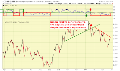
The Nasdaq saw a stronger recovery vs. the S&P500  last week, rising over 3.7%, but had suffered a higher loss during the early March weakness.  This index continues to sport obvious underperformance vs. the S&P500:


VIX saw a significant decline last week. As noted in the chart below, VIX fell from over 29 and closed just below 18 and below its 50-day moving average near 20. The index at 29 represented a huge gap from its 50-day moving average of 19 (such large gaps tend to mark turning points in equities), which coincided with the correction's bottom during the week of March 14 (foreshadowing the bounce last week). VIX is now at a neutral reading (neither bullish nor bearish), and the Put/Call ratio at .84 is likewise neutral.  See the VIX chart below:


Our "NYMO" indicator, the McClellan Oscillator advance/decline measure of the New York Stock Exchange, flashed a positive sign last week.  The indicator closed above its 13 and 34-day moving averages, and importantly, its cumulative summation index returned to bull market territory (closing over the 400 level):


As for other indicators, most saw improvement on the week. Our corporate debt/medium-term Treasury ratio turned around to positive territory last week, tipping the scales in favor of equities. Small Cap stocks continue to beat large caps, and growth continues to shine vs. value.  Discretionary stocks performed better than Staples on the week, another positive.

What had originally looked like an oversold bounce is getting closer to transforming itself into a resumption of the strong uptrend and another possible bout with the recent highs. Volume however has been weak, and quality stocks are not showing the eager bullishness that one would expect in this uptrend. The uptrend is tiring, and positive seasonal conditions may be giving it enough juice to continue higher in a rather haphazard way.

Click here for the updated Market Tour on StockCharts.com.

Sunday, March 20, 2011

Market Tour Update

Although the bounce from the lows that were touched earlier in the week were impressive (the S&P500 fought back a 4% loss to a 1.9% loss by week's end), volume was light on the bounce, and Friday's action, as the major indices whittled away at their early morning gains as the close drew near, was less than impressive for the Bulls.

Both the S&P500 and Nasdaq stocks trading above their 50-day moving average fell to the lows last seen in August, then bounced as the week ended.  VIX and the Put/Call ratio remain elevated but settled back from extremes reached earlier in the week (VIX hit its highest level since early August). The "Fear" readings in these two indicators suggest more jittery market behavior is likely.

Probably the most disturbing technical indicator that soured last week was the NYSE Summation Index which, for the first time since November, fell below the Bullish zone market by the 400 level (the index closed at 387 on Friday). This level has been useful in identifying bullish and bearish zones in equities. Last year, it remained convincingly below 400 from the "flash crash" into August.  A bearish cross of NYSI vs. its 20-day moving average also occurred two weeks ago.  See the chart below:


On the bright side, financial stocks outperformed for the second week in a row. The return of dividends and potential stock buybacks for the group, deferred since the 2008 crash, caused the relative strength index of XLF (Financials ETF) to push above the 50 line this week.  See below:


Our Corporate Bond Medium-term Treasury Bond ratio bounced last week but remains in favor of bonds, a trend change noted in last week's Market Tour update:


As for our other indicators, Discretionary stocks took a hit in relative strength vs. Staples (a negative for equities), but small caps and growth continue to follow their relative strength uptrend vs. large caps and value, respectively, two additional signs of a bullish trend.

Although its weekly trends remain up, the Nasdaq appears to be experiencing more technical damage than the S&P500, as it maintains its relative underperformance.


So, we have a mix of positive and negative indicators, with the NYSE Summation Index flashing the most disturbing signs. A "watch and see" attitude may be most prudent at this juncture. We see next level support on the S&P500 at 1260, with major support near 1230 (below which a clear downtrend would be at hand). A move above 1300 (Friday's close was 1279) would positively reinforce the continuation of the uptrend and cause us to sift for bullish opportunities.

Click here for the latest Market Tour on StockCharts.com.

Sunday, March 13, 2011

Warning signs

Several of our proprietary trend-following indicators flashed warning signs last week, but significant damage to the uptrend in equities was avoided. Our S&P500 trend-following indicator closed the week on a positive note (after generating a sell signal following Thursday's close). Volume on declining days, however, has been noticeably stronger than volume on up-days, suggesting institutional distribution.

More disturbing is the gap down seen last week on the Nasdaq. In addition to the selloff on higher volume, the Nasdaq continues its clear downtrend in underperformance vs. the S&P500. Stocks trading above their 50-day moving average fell below the trough formed during the November setback, suggesting perhaps a further correction toward the August lows. See below:


We found similar underperformance in small caps versus large caps, suggesting asset shifts toward more defensive positions. Interestingly, financials caught a bid last week compared to the broader S&P500. There has also been clear movement into more defensive positions in healthcare and staples.

Our relative performance of copper (our proxy for the industrial economy) versus US Treasuries reversed gains from the prior week that took the ratio above resistance market by three highs achieved since 2006. Strength in this indicator has reliably identified bull markets in equities. See the chart below:


Similarly, our corporate bond/treasury bond ratio flashed a clear warning sign last week. Historically, when LQD (investment grade corporate bond index) leads IEF (7-year T-Bond), equities are favored. This uptrend (which has persisted since the November setback in equities) was broken last week, flashing a warning sign to equity bulls. See the chart below:


Equities are facing their biggest challenge to the uptrend since the August and November corrections. As price is the ultimate judge of the market's health, we will look for any break in the price uptrend as a signal to shift to the short side.  This week, we lightened up on longs, established some partial shorts as hedges, awaiting either a clear signal to more aggressively join the downside trade, or to "buy on the dip" should price action suggest a basing pattern and establish new support.

Click here for the updated Market Tour on StockCharts.com.

Sunday, March 6, 2011

A Selective Uptrend

Despite a rise in volatility, with daily gains and losses of 150 points or more on the Dow becoming more commonplace, the uptrend in equities remains intact. One particular change that appears is growing divergence across international markets and sectors (i.e. the underperformance in emerging markets and more pronounced weakness in Financial stocks), which suggests that should the uptrend continue, a more selective stance may be warranted.

The S&P500 and the Nasdaq both found support at the "50" line of their respective relative strength indicators; in an uptrend, support is typically found in the 40-50 range (with highs over 80). See the chart of S&P500 below, where the blue vertical line denotes the spilt between a bearish trend with RSI lows below 40 (to the left) and a bullish trend.


We have been carefully eyeing the Nasdaq relative to its 2007 peak. That peak, at 2861, represents resistance to the uptrend, and the break-through of price through this level (or deflection from it) would provide another clue to the sustainability of the uptrend in equities in general.  See the weekly chart of Nasdaq below:


Interestingly, the Nasdaq has been underperforming the S&P500 since mid-January. Looking back 20 years, we find the Nasdaq outperforming the S&P500 at market bottoms (it surged decisively following the 2002 bottom for 15 months, and did the same at the March 2009 bottom). In both cases, its relative underperformance was not an omen for a general market decline, but simply a favored rotation to other sectors and asset classes. All the more reason to be more selective should this uptrend in equities remain intact.  See the weekly Nasdaq/S&P500 chart below:


Money continues to be flowing toward commodity-driven indices and sectors. Canada (ETF symbol EWC) and Russia (ETC symbol RSX) are two such markets that sport a wealth of natural resources (and are increasingly driven by demand growth from China).  On the flip side, emerging markets feeling the inflationary pinch from rising raw materials prices are underperforming. See below:


Silver, gold and oil ETF's maintain their lead with silver (the "poor man's gold") outperforming its yellow cousin. At some point, these asset classes get crowded by traders and investors, only to relinquish their gains to other interesting plays.

Relative strength continues to be shown by semiconductors, as SMH has outperformed the broader Nasdaq.
See below the chart of SMH relative to the Nasdaq. It is noteworthy that the semiconductor space has underperformed the Nasdaq since late 2003 and has only broken out in relative performance since Q4 2010.


Other sectors and asset classes displaying bouts of relative strength include the following (in no particular order of significance):
  1. Inflation-protected bonds
  2. Oil, Gold, Silver, most agricultural commodities
  3. Resource-rich economies (Canada, Russia)
  4. Healthcare and Utilities (potential risk-averse plays)?
  5. Currencies such as the Canadian and Australian dollar (their natural resource-driven economies playing a role in their strength).
As the rally in equities matures, it behooves the trader and investor to identify those asset classes and sectors exhibiting relative strength and to allocate funds to those areas.
Click here for the latest Market Tour on StockCharts.com.